
Case study · Campaign breakdown
The meerkat more famous than the brand
Read article →
Water is arguably the most boring, commoditised product on the shelf. Liquid Death looked at that same blue bottle and pure-mountain-water clichés everyone else was copying, and built a skull-branded, death-obsessed empire out of pure absurdity instead.
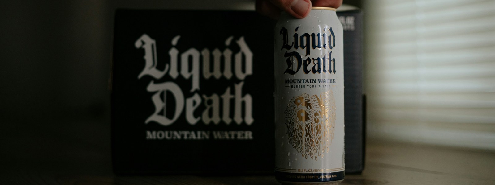
Liquid Death went from nothing to a billion-dollar valuation in under 10 years, selling a product with zero functional difference from any other bottled water on the shelf. The entire strategy was branding, not liquid - and it's one of the sharpest lessons in category disruption of the last decade.
Here's how a skull logo and a tagline about death turned the most boring product imaginable into one of the most talked-about beverage brands in the world.
Bottled water has almost no room for genuine product differentiation. It's water. Every brand is drawing from broadly the same well of visual language too: a blue label, a mountain or a stream somewhere in the artwork, and the word "pure" stuck on prominently, as if that needed confirming.
That sameness isn't an accident - it's brands playing it as safe as physically possible in a category where there's genuinely very little to say about the product itself. The result is a shelf full of bottles that are, for all practical purposes, interchangeable.
In 2017, Liquid Death launched with a proposition that had nothing to do with the water inside the can, and everything to do with how it looked and sounded. Still water, packaged in a tallboy can that looks like it belongs in a craft beer fridge, wrapped in heavy-metal typography, topped with a skull logo, and sold under the tagline "murder your thirst."
There was no health claim, no premium sourcing story, no functional benefit over any competitor's bottle. The entire pitch was the absurdity of the branding itself.
Liquid Death's branding deliberately creates what psychologists call cognitive dissonance - a state of mental discomfort that occurs when something violates an expected social norm. Water is meant to look wholesome, clean, gentle. A can covered in skulls and death imagery breaks that expectation on sight, and that break is exactly what makes people stop, look twice, and talk about it.
A conventional water bottle asks nothing of the person looking at it - it confirms what they already expect, and gets forgotten instantly. Liquid Death's branding asks a genuine question: why does water look like this? That question is what gets a product photographed, shared and discussed, in a category where almost nothing else earns any attention at all.
It would be easy to read Liquid Death's branding as a gimmick layered on top of a normal water business.
Nobody buys Liquid Death because they believe it's meaningfully purer or better-tasting than a competitor. They buy it because the can itself is a piece of personality they want to be seen holding.
Liquid Death didn't win by improving water. It won by refusing to look like water is supposed to look. In categories where genuine product differentiation is close to impossible, differentiation through branding and tone can matter more than any functional claim you could make. It's a similar bet to the one Compare the Market made with its meerkat - building a brand asset so distinctive it outgrows the product it was built to sell.
Nobody was trying to make water exciting before Liquid Death, precisely because everyone assumed it couldn't be done. That assumption is exactly what created the opening. The most boring, most-ignored category in any market is frequently the one with the most room to build something genuinely distinctive, simply because the bar for interesting has never been tested.
Liquid Death didn't need advertising in the traditional sense to build recognition - the can itself does almost all of the work. A distinctive enough piece of packaging, in a category where every competitor looks the same, functions as a permanent, self-replicating advert every time it's sitting on a shelf, in a fridge, or in someone's hand. It's the same principle behind Heinz's bottle shape doing more identifying work than its logo - the packaging itself becomes the asset.
Liquid Death proved that a product doesn't need to be exciting for the brand around it to be. Water is inherently boring; the branding wrapped around it wasn't. That gap between an unremarkable product and a genuinely remarkable brand identity is where Liquid Death built a billion-dollar business, in a category everyone else had quietly agreed wasn't worth trying to make interesting.
What makes Liquid Death different from other bottled water brands?
Liquid Death sells still and sparkling water in tallboy cans with heavy-metal branding, a skull logo, and a tagline of "murder your thirst." The water itself isn't functionally different from competitors; the differentiation comes entirely from branding and packaging.
How did Liquid Death grow so quickly?
Liquid Death's shock-branding approach generated significant organic attention and social sharing in a category where most products are visually indistinguishable from one another, helping it scale from launch in 2017 to a billion-dollar valuation within under a decade.
Can the Liquid Death approach work in other boring product categories?
The underlying principle - using distinctive, even deliberately jarring branding to stand out in a category where every competitor looks the same - can apply well beyond bottled water. The key requirement is a category where genuine product differentiation is difficult, leaving branding as the primary lever available.
Book a 30-minute call and we'll help you find the branding angle nobody else has tried.
Book a 30-minute call
No-fluff takes on what brands get right, get wrong, and stay strangely quiet about - delivered straight to your LinkedIn feed. Free, and worth the inbox space.
Subscribe on LinkedIn